Now that
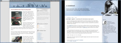
we know what you want your blog to look like, we can start working on the Blogger template. For the benefit of readers just picking up on this series, we are trying to personalize the look of the e.Guidebook blog. Here's a before/after visualization:
To make things easier for myself, I will modify an existing template rather than creating one from scratch. From the
Layout tab, click on
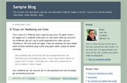
Pick New Template. Choose a template that matches your desired layout most closely. For me, I'm going with
Minima which looks like this:
Now, the dimensions of this layout isn't quite what I visualized. I wanted a center panel that was 1000 pixels (px) wide. Minima is 740px. So let's change that.
- From the Layout tab, click on Edit HTML. Yes. I am going to edit the code. Don't be scared. If anything goes wrong, I can always go back and pick Minima and join the all-look-same crowd.
- Now, I'll copy all the code in the text box and paste it into Notepad so I have a working copy of the code. Need to remember to save this file frequently.
- Oh good, the code looks very tidy. I like Minima.
- Now, to change the width to 1000px. I change the part of the code called #outer-wrapper:
#outer-wrapper {
width:740px;
width:1000px;
margin:0 auto;
text-align:$startSide;
font: $bodyFont;
}

Hmm... it looks terrible. Let's widen the other 2 panels as well. I want the blog content panel to be 700px wide and the widgets panel to be 300px. Change the widths of the following sections of code:
#main-wrap1 {
width:700px;
float:$startSide;
background:$mainBgColor
 url("http://www1.blogblog.com/rounders/corners_main_bot.gif") no-repeat

...
#sidebar-wrap {
  width:300px;
float:$endSide;
margin:15px 0 0;
font-size:97%;
line-height:1.5em;
word-wrap: break-word; /* fix for long text breaking sidebar float in IE */
overflow: hidden;     /* fix for long non-text content breaking IE sidebar float */
}

OK, now the panels look like they are the right widths, but the blog content isn't using the full width. There are 3 widths to change to fix this. I will use a blog content width of 680px so that there's a 20px margin on the right edge.
#main {
background:url("http://www.blogblog.com/rounders/rails_main.gif")
 repeat-y $startSide;
padding:0;
  width:680px;
}

.main .widget {
margin-top: 4px;
  width: 680px;
padding: 0 13px;
}

.main .Blog {
margin: 0;
padding: 0;
  width: 680px;
}

Much better. Let's now get rid of all those rounded corners. Those are actually images strategically positioned. So just look search the code for all instances of ".gif" and you can easily find all the corners. There is a vertical line going down the main section. Those are called rails and they are images too. So as you go through looking for all the GIFs, you can start removing anything that looks like
corners and
rails. Here's what I found:
#main-wrap1 {
width:700px;
float:$startSide;
background:$mainBgColor url("http://www1.blogblog.com/rounders/corners_main_bot.gif")
no-repeat $startSide bottom;
margin:15px 0 0;
padding:0 0 10px;
color:$mainTextColor;
font-size:97%;
line-height:1.5em;
word-wrap: break-word; /* fix for long text breaking sidebar float in IE */
overflow: hidden;     /* fix for long non-text content breaking IE sidebar float */
}

#main-wrap2 {
float:$startSide;
width:100%;
background:url("http://www1.blogblog.com/rounders/corners_main_top.gif")
no-repeat $startSide top;
padding:10px 0 0;
}
#main {
background:url("http://www.blogblog.com/rounders/rails_main.gif")
repeat-y $startSide;
padding:0;
width:680px;
}

#header-wrapper {
background:$titleBgColor url("http://www2.blogblog.com/rounders/corners_cap_top.gif")
no-repeat $startSide top;
margin-top:22px;
margin-$endSide:0;
margin-bottom:0;
margin-$startSide:0;
padding-top:8px;
padding-$endSide:0;
padding-bottom:0;
padding-$startSide:0;
color:$titleTextColor;
}

#header {
background:url("http://www.blogblog.com/rounders/corners_cap_bot.gif")
no-repeat $startSide bottom;
padding:0 15px 8px;
}

#sidebartop-wrap {
background:$topSidebarBgColor url("http://www.blogblog.com/rounders/corners_prof_bot.gif")
no-repeat $startSide bottom;
margin:0px 0px 15px;
padding:0px 0px 10px;
color:$topSidebarTextColor;
}

#sidebartop-wrap2 {
background:url("http://www2.blogblog.com/rounders/corners_prof_top.gif")
no-repeat $startSide top;
padding: 10px 0 0;
margin:0;
border-width:0;
}

#sidebarbottom-wrap1 {
background:$mainBgColor url("http://www.blogblog.com/rounders/corners_side_top.gif")
no-repeat $startSide top;
margin:0 0 15px;
padding:10px 0 0;
color: $mainTextColor;
}

#sidebarbottom-wrap2 {
background:url("http://www1.blogblog.com/rounders/corners_side_bot.gif")
no-repeat $startSide bottom;
padding:0 0 8px;
}

#footer-wrap2 {
background:$titleBgColor url("http://www2.blogblog.com/rounders/corners_cap_top.gif")
no-repeat $startSide top;
color:$titleTextColor;
}

#footer {
background:url("http://www.blogblog.com/rounders/corners_cap_bot.gif")
no-repeat $startSide bottom;
padding:8px 15px;
}

Voila! That's good enough for today. Our dimensions are ok save for the header height. We'll work on the header in the next blog.


 Posts
Posts

